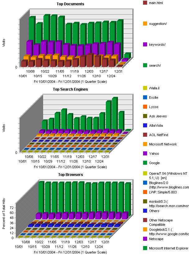
Google Analytics lets you toggle between pie and bar chart, but it really seems logical to have a 3rd chart option that makes a line graph comparing the top 10 items from any report section. For example for web browsers you could see historically how the percentage of Firefox users goes up and Internet Explorer users goes down. This type of chart would be useful for virtually any existing report… Keyword Considerations, Browser Versions, Platform Versions, Referring Source, etc. WebTrends can generate multi-dimensional bar charts which yields the same results.
Basically it would be the “Data Over Time” chart that Google Analytics generates already, but for more than one item.
Here’s a couple examples to illustrate: